

Hero
The hero briefly explains the value of the page or product and offers the next step. It opens a landing page and is not repeated inside an article. The block stretches across the full window width by itself and sets the background, so you do not need to wrap it in a surface.
Example
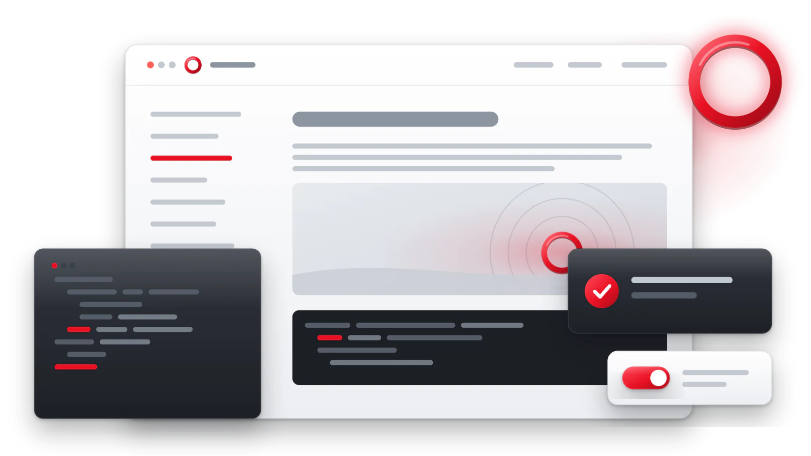
Markup
:::hero
# A short heading
One or two sentences about the value of the page.
[Main action](/en/start/)

:::
- The block starts with one
#heading, then one or two paragraphs. - After them come up to two action links and one image, in this order.
- Other Docara blocks and Smart components do not nest inside. Wrapping it in a surface is rejected: the hero already controls its width and background.
Without a background image or an effect, the hero has a light fill with semi-transparent accents. It follows the light and dark theme by itself.
Variants
Layout
layout=split puts the text and the image in two columns on a wide screen,
centered centres everything, compact gives a short introduction without
an image.
Height
padding sets the top and bottom padding. By default compact has lg,
the others xl.
| Value | Top and bottom padding |
|---|---|
lg |
SIMAI Framework step 3: 16 px on a narrow screen, 24 px from 960 px |
xl |
SIMAI Framework step 4: 24 px on a narrow screen, 32 px from 960 px |
2xl |
Grows with the window width: 48 px on a screen up to 400 px, then smoothly up to 112 px on a screen from 1470 px |
2xl gives a landing hero volume without your own CSS. The background
effect’s pause button fits into the 2xl bottom padding, so a block with an
effect does not get taller.
Image
media sets the role of the image:
| Value | Meaning |
|---|---|
auto |
The image is optional; if present, it stands next to the text |
side |
One meaningful image next to the text, with a description; only for layout=split |
background |
One decorative background image, with an empty description  |
none |
No image |
The background image comes from the same Markdown image at the end of the
block. The file must be in the project’s assets/: external addresses and
paths outside the project are rejected at build time. The background
position, the overlay and its strength are set by background_fit,
background_x, background_y, overlay and overlay_strength — they work
only with media=background.
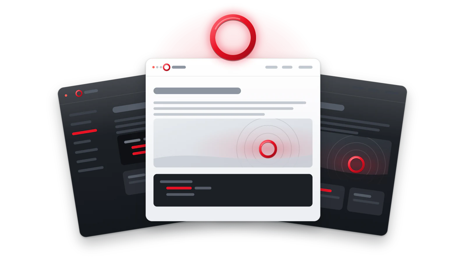
Documentation without extra complexity
The text stays readable over the overlay.
Background effect
Instead of a background image, the hero can show an animation from the
SIMAI effect catalogue. The catalogue is connected once in docara.json,
and the effect is chosen with the effect parameter. An effect does not
combine with media=background.
:::hero {layout=centered padding=2xl effect=constellation-net}
# Documentation that is easy to read

The effect is drawn under the text and does not get in the way of reading.
:::
How to connect the catalogue, choose an effect and what your hosting needs for Content-Security-Policy is described on the Background effects page.
States
Pause and reduced motion
While the effect moves, the bottom padding has a pause button. If reduced motion is turned on in the system, the effect shows a still frame.
Accessibility
- The hero heading is the main page heading
<h1>: there is only one on the page. - Action links are plain links: Tab and Enter. Write the action in them: “Open the quick start”.
- A meaningful image (
side) needs a description — without it the build stops. A background image is decoration with an empty description. - The overlay (
overlay) keeps the contrast of the text over the background. Check readability in the light and dark themes.
Parameters
| Parameter | Values | Default | Sets |
|---|---|---|---|
layout |
split, centered, compact |
split |
The layout: split puts text and image side by side, centered centres everything, compact is a low block. The old name variant is accepted with a warning. |
padding |
lg, xl, 2xl |
— | The inner padding at the top and bottom. |
media |
auto, side, background, none |
auto |
Where the image is: auto follows the layout, side is next to the text, background is the background, none is no image. |
background_fit |
cover, contain, auto |
cover |
How the background image fills the block. |
background_x |
left, center, right |
center |
The horizontal position of the background image. |
background_y |
top, center, bottom |
center |
The vertical position of the background image. |
overlay |
light, dark |
dark |
A darkening or lightening over the background so that the text is readable. |
overlay_strength |
soft, medium, strong |
medium |
The strength of the darkening or lightening. |
effect |
string | — | The name of a SIMAI Framework background effect. |
effect_theme |
auto, dark, light |
auto |
The effect theme: follows the page theme, always dark or always light. |
effect_settings |
string | — | The effect settings as JSON. |
See also
- Background effects
- Landing blocks
- Surface
- Banner — an announcement inside a regular article