

Landing blocks
You build a product page from these blocks: this site’s home page
is made of them, a hero and collapsible questions. The blocks are written
in plain Markdown between :::name and :::. The content defines the look,
and SIMAI Framework sets the width, spacing and theme.
| Block | Purpose |
|---|---|
features |
Two to six cards: an icon or an image, a heading and a short text |
showcase |
A heading, an explanation, an action and a large image of the result |
promo |
The final block of the page with one action |
columns |
Two to four columns of text side by side |
cta |
One prominent button link |
Example
- Markdown.Pages are written as plain text.
- JSON.Settings are checked by schemas.
- HTML.The finished site opens without a server.
Markup
- A block starts with a
:::nameline without indentation and ends with a:::line. - Blocks do not nest in each other or in other Docara blocks. Inside
columnsyou can write plain Markdown. - Links and images are only
https://or paths inside the site. - Breaking the rules stops the build with a clear code, for example
MARKDOWN_FEATURES_ITEM_COUNT_INVALIDorMARKDOWN_CTA_LINK_REQUIRED. All codes with causes and fixes are in the page error reference.
The hero is described on the Hero page, collapsible questions on the Details page. How the home page is built is told on the How the home page is built page.
Features: feature cards
The block turns a bulleted list into a grid of cards. The list has two to
six items, each with one paragraph. An item can start with an :icon[...]
icon or an image: they go above the card text. Bold text at the start of an
item becomes the card heading.
- Fast.The build outputs finished HTML, CSS and JavaScript.
- Search.The index works in the reader’s browser without a server.
- Languages.Each language is its own folder of Markdown.
An icon that is not written first stays an ordinary icon inside the text.
Instead of an icon you can put an image:
-  **JSON.** Text.
The image in a card is decorative, so its alt can stay empty.
 Markdown.The content stays readable source text.
 JSON.Settings are inherited and checked by schemas.
 PHP.The build does not need Node.js.
Showcase: show the result
The block shows the result large: a second-level heading, one or two paragraphs of description, an optional action link and one image on the last line. The image must have a description (alt) because it carries meaning. On a wide screen the text stands next to the image, on a narrow one above it.
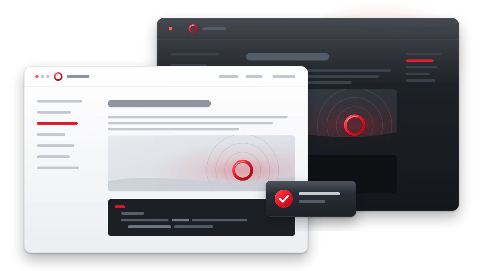
Promo: final call to action
The block closes the page: a second-level heading, one or two paragraphs and exactly one action link. An image on the last line is optional. The block stands out with a muted background. On this site’s home page, promo stands at the very end and leads to the quick start.
Columns: columns
The block places two to four parts of text side by side. The parts are
separated by a separate --- line with blank lines before and after it. On
a narrow screen the columns stack in the same order.
Markdown
The content stays readable source text.
JSON
Settings are inherited and checked by schemas.
PHP
The build does not need Node.js.
Inside a column you can write plain Markdown: paragraphs, lists, links. An empty column stops the build.
CTA: action button
The block shows one link as a prominent button. It holds exactly one link with text.
If there are several actions, use button links in a paragraph or a showcase with links.
Accessibility
featurescards andcolumnsgo in source order: on a phone they stack in the same order in which they are written.- The image in
showcasecarries meaning, so it must have a description. Images infeaturesandpromoare decoration, their description can stay empty. - Action links in
showcase,promoandctaare plain links: Tab and Enter. Write the action in them: “Go to the quick start”. - Block headings (
##inshowcaseandpromo,###incolumns) are part of the page structure: keep their levels in order.
Parameters
:::columns
No parameters.
:::cta
No parameters.
:::features
No parameters.
:::promo
No parameters.
:::showcase
No parameters.
See also
- Hero
- Grid and card — your own card grids
- Button link
- How the home page is built